
How Streetwear Brands Create Recognition Without Loud Logos

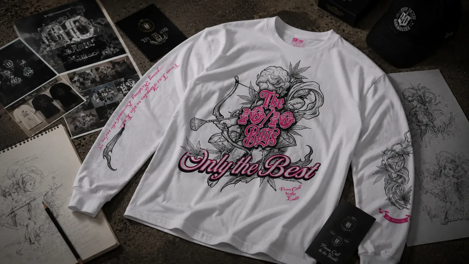
Streetwear brand recognition rarely comes from the size of a logo. It comes from repetition: the same proportions, the same colour decisions, the same illustration style and the same placement choices appearing across piece after piece until people can identify a label from across a room. A large chest print can be completely forgettable. A specific sleeve detail, repeated for three seasons, usually is not.
Silhouette, colour, typography, graphic placement, finishing details and cultural presence all feed one system. Here is how they combine into an identity that holds up without shouting.
What Is Streetwear Brand Recognition?
Streetwear brand recognition is the ability to identify a brand from its visual and product codes — silhouette, colour, graphic style, typography and finishing details — even when its name or main logo does not dominate the garment.
That is not the same as popularity. A brand can be highly recognisable inside a small community and almost unknown outside it, because recognition measures how clearly the codes read, not how many people have seen them.
It also sits apart from personal identity. What a streetwear fit communicates is about the person wearing it. Streetwear brand identity is the set of visual decisions a label repeats. Brand recognition is what happens when enough people read those decisions without being told.
Recognition Starts with a Consistent Design Language
A design language is the set of rules a brand keeps returning to. In streetwear that usually means a small group of decisions: the shapes it cuts, the palette it works in, the way it draws, the type it sets, where graphics land on the body, which symbols reappear, and how the pieces get photographed.
A brand that prints one graphic on everything has a product, not a language. The stronger version holds the rules steady and lets the content change, so variety survives and recognition survives with it.
Silhouette Can Become a Signature
Shape reads before print does. At distance you register the drop of a shoulder, the width of a body and where a sleeve ends long before you resolve a graphic, which makes silhouette one of the first things a brand can own.
The variables are specific: how far the shoulder seam falls, how much room sits through the chest, sleeve length against the wrist, hem length against the hip, and how a jogger tapers. Repeat those measurements across oversized graphic tees and oversized hoodie designs and the fit itself becomes identifiable.
A signature silhouette still has to work. Proportions that look sharp in a photo but feel restrictive on a long day get worn once, and a piece that stays in the wardrobe builds recognition for nobody.
Colour Creates Memory Before People Read the Name
A controlled palette can make a design easier to recognise, because the eye sorts colour faster than it reads text. Black is the common base in streetwear for practical reasons: it holds print contrast, photographs consistently and combines with almost anything. What separates one black-based label from another is usually the accent, whether that is a particular gold, a specific pink, or a green that turns up on a cap one season and a tee the next. Used carefully, an accent may become associated with the brand rather than the product.
Restraint is the harder part. A palette that grows with every drop can suggest range, but it resets what people have already learned. Building a dark streetwear outfit around a stable base and one repeated accent reads as more deliberate than a look assembled from six colours.
Typography Works as a Graphic, Not Just Information
Type does two jobs. One is functional: telling you what the piece says. The other is visual, where lettering behaves as artwork and the words matter less than the shape they make.
Ornamental lettering, gothic or classic-inspired letterforms, a phrase that returns season after season, text set vertically down a sleeve or a trouser leg: these can be recognised at a glance, often before anyone consciously reads them. Someone who knows the brand identifies the weight and curve of the letters the way they would a signature. Recurring phrases work the same way. When one line appears on a sock, a scarf and a long sleeve, it stops being a slogan and becomes part of the brand’s vocabulary.
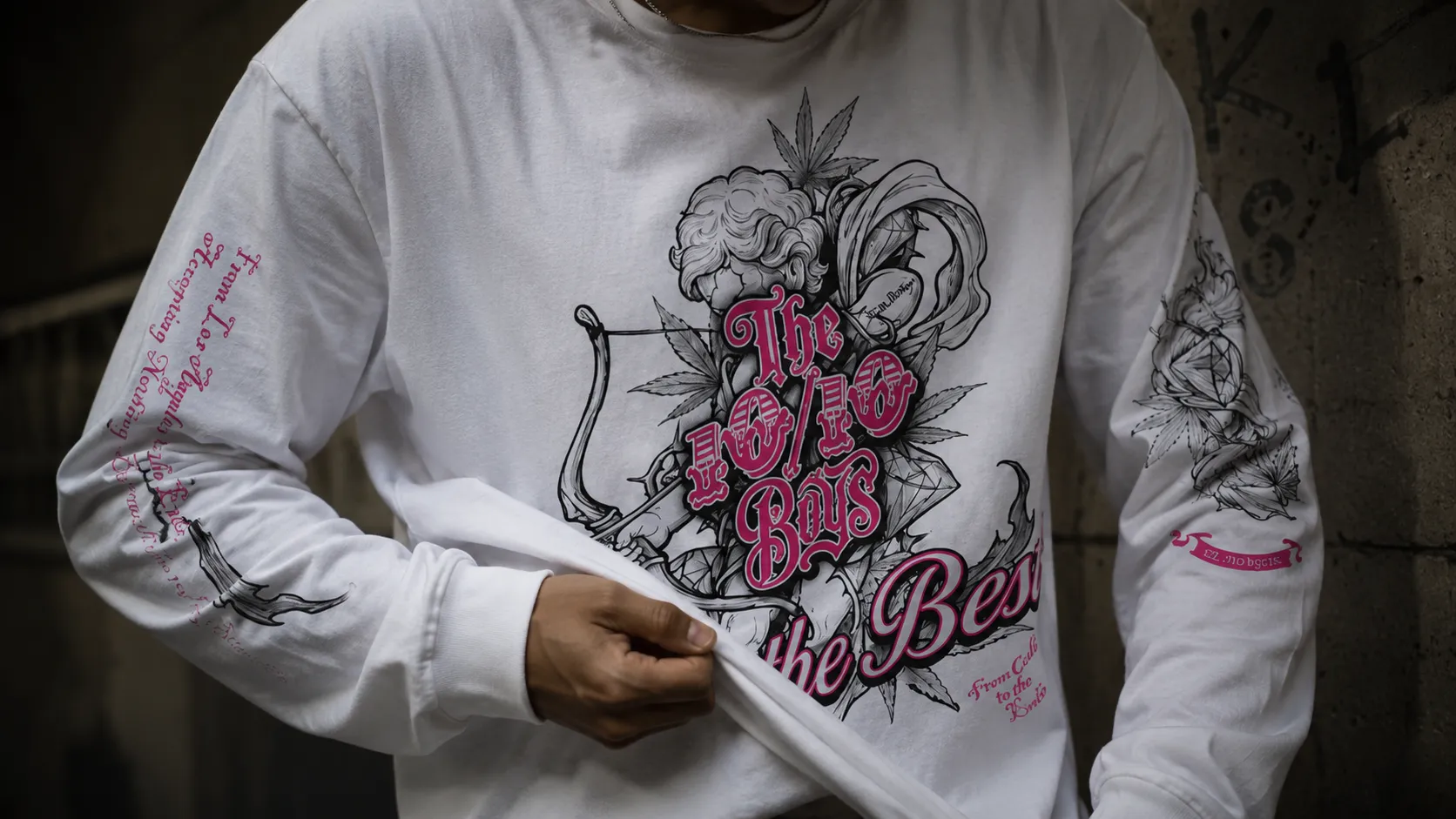
Where a Graphic Sits Is Part of the Code
Placement is often more memorable than scale. A small chest emblem paired with a large back print is a structure, and structures are easier to recognise than individual artworks because they survive every change of design.
Common placement codes include a compact left-chest mark, a full graphic across the back, lettering down the sleeve, an emblem on the outside of the leg, and a small print near the hem. What creates the code is never one of these on its own, but the same arrangement showing up across different pieces.
So a bigger logo does not automatically mean stronger recognition. Where a mark sits, how it contrasts against the fabric and how it relates to the cut tend to stay in memory far longer than how much space it takes up.
Small Details Reward People Who Pay Attention
Subtle streetwear branding is built for people already looking: a secondary symbol tucked into the artwork, a phrase printed where only the wearer sees it, discreet embroidery on a cuff, a badge stitched into a fold. None of these do much work at a distance, and that is the point.
Details like these are not a test, and they are not there to separate insiders from everyone else. They reward attention. Someone who has owned a few pieces starts noticing the through-lines, and each new release confirms something they already half recognised. Smaller items carry this well: caps and headwear, socks and knitwear have limited surface area, so a brand has to commit to one exact detail rather than a full graphic.
Repetition Builds Recognition, Copying Does Not
Repeating a code and repeating a design are different things. A brand can keep the same palette, drawing style, placement structure, type family and photographic treatment while changing the actual artwork every release. Each drop stays distinct, and the identity accumulates.
Reprinting one graphic in new colours does the opposite. It looks consistent for a while, then it stalls, and there is nothing fresh for anyone to recognise because nothing fresh is being made. Consistency works as a framework, never as a template. That is also where authenticity in streetwear separates from chasing trends: a brand with real codes can sit out a cycle without losing shape.
Culture Makes a Visual Identity Stronger
Recognition is not built entirely inside the garment. Where a brand appears matters: events and stands, verified collaborations, the underground music and skate scenes it sits close to, how its photography is shot, and how the people around it actually wear the pieces.
Consistency across all of that is what makes visual codes stick. When product, imagery and physical presence carry the same tone, each reinforces the others; when they pull apart, the clothes do the work alone. The story behind the brand and the meaning behind The 10/10 Boys belong to the same system as the graphics.
How to Tell If a Streetwear Brand Has a Strong Identity
You can assess streetwear brand recognition without any inside knowledge. Pull up a full collection and work through a short list:
- Do the pieces look like they came from the same brand?
- Do colours and graphics relate to each other across the range?
- Do the silhouettes feel deliberate rather than default?
- Is the typography recognisable from piece to piece?
- Do specific details reappear without looking forced?
- Does the photography hold one consistent language?
- Could you identify the brand with the name covered?
- Do new releases move forward without abandoning what came before?
That last question is the useful one. Plenty of brands manage consistency for a single season. Far fewer stay recognisable across three while still making something new.
The 10/10 Boys and Recognition Through Detail
The 10/10 Boys is an independent brand building recognition the same way, through elements that repeat. The line Only The Best, Nothing Less runs across the range, from accessories through to heavier pieces, and from L.A. to the ends appears alongside it often enough to work as a second signature.
The product codes are just as consistent. Tees carry a signature emblem across the chest with statement artwork on the back, and the long sleeves extend that logic with front, back and sleeve artwork on a relaxed cut designed to be worn oversized. Joggers use side-leg branding set vertically down the outside of the leg, the beanie carries a stitched badge on a fold-up cuff, and the socks place branding above the ankle with the slogan on the sole. Black bases with gold, pink, blue or green accents hold the palette together, while illustrated artwork and ornamental lettering keep the drawing style familiar. You can see the design language across the collection more clearly than any single piece shows it.
FAQs About Streetwear Brand Recognition
What is streetwear brand recognition?
It is the ability to identify a brand from its visual and product codes — cut, colour, graphic style, typography and finishing details — without relying on a large logo or a visible name.
Can a brand be recognisable without a large logo?
Yes. Placement, proportion, contrast and repetition carry more weight than logo size. A small mark used the same way on every release is easier to remember than a large one that moves around.
What makes a streetwear brand visually consistent?
A fixed set of rules applied to changing content: a narrow palette, one illustration style, a recognisable type family, recurring placement structures and a steady photographic approach.
Why are silhouettes important to brand identity?
Shape reads at a distance before print does. Repeated proportions such as shoulder drop, body width, sleeve and hem length can make a garment identifiable before any graphic resolves.
How do small clothing details build brand recognition?
They reward repeat buyers. Embroidery on a cuff, a woven label or a small emblem confirm continuity between pieces, strengthening recognition gradually rather than at first glance.
The Code Is in the Repeats
The strongest streetwear identities are not built by making the logo louder. They are built through repeated details, recognisable artwork, consistent proportions and a design language that connects one piece to the next. Look at how those codes carry across tees, hoodies and headwear, and you can read a recognisable streetwear brand before you read its name.